Time to match wits…
Your R Club buddies have been experimenting with ways to plot data with ggplot. Below is a sampling of their efforts. Your duty this week is to choose at least three plots and figure out how they were plotted.
If the datasets don’t look familiar, be sure to scroll down to the ‘Data’ section of the ggplot2 docs.
Challenge 1
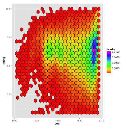
Stacey plotted movie rating since the dawn of cinematography (binned by density) .
Challenge 2
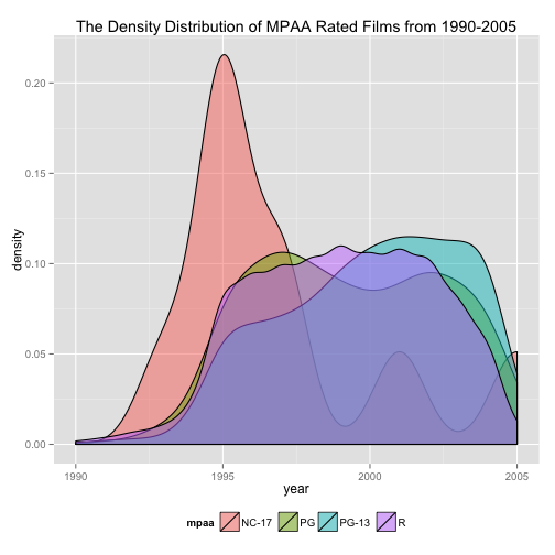
Ciera plotted MPAA movie rating trends over the last couple decades.
Challenge 3
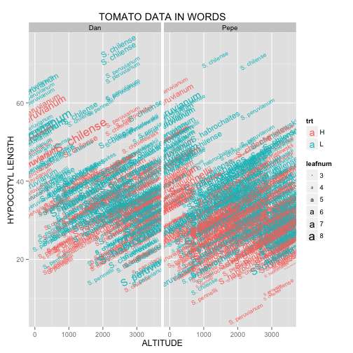
Miguel is a huge fan of the written word. One of his life goals is to bridge the gap between science and literature. He made this plot in hopes of advancing this cause.
Challenge 4
Cody found a geom that can be used to compare distributions by plotting them along the axes. Can you find it, too?
Challenge 5
For Valentine’s Day, Jessica received a $20 gift card for a local gas station. Before she redeems it, she wants to find out which types of car will get her to the Bay Area and back on five gallons.
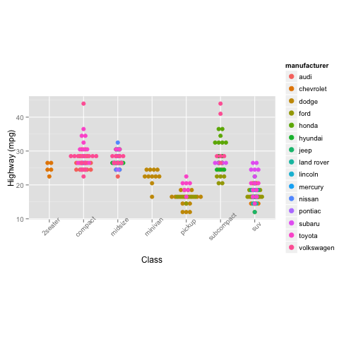
Challenge 6
Hsin-Yen was curious about the terrain and altitude where various tomato species have been found in the wild.
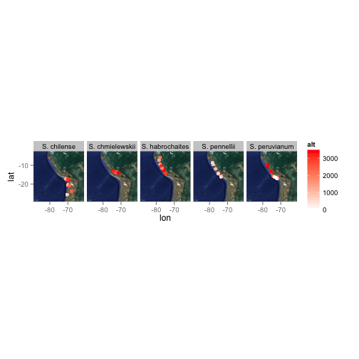
Challenge 7
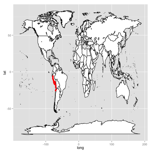
Not one to be outdone, Stacey demonstrates that she also knows the ways of the world by plotting the geographical position of tomato species collection points on top of not just a part of South America, but on top of the entire world.